How-To Guide: Working With Images
 This How-To Guide is the second part of a three part series on web page development. The first guide, Creating Links, provides a simple introduction to HTML, how to create links to external content, and how to include content from other sources inside your own pages. This guide, Working With Images, provides an introduction to the IMG tag and CSS, image size recommendations and how to use this information using the visual mode of the site editor.
The first two guides provide examples of how features are coded in HTML as well as how they can be applied using only the visual mode of the site editor. Even if only the visual mode of the editor is used, knowledge of what happens behind the scenes (in the HTML) can make using it more natural. The third guide (Teachers Network CSS Styles) provides a reference for all Teachers Network CSS styles.
The complete series:
- Creating Links – Introduction to HTML, how to create links to other content and how include other content with links.
- Working With Images – (this guide) – Introduction to the IMG tag and CSS, image size recommendations and visual editor CSS procedures.
- Teachers Network CSS Style Reference – Teachers Network CSS style reference guide.
This guide assumes the reader has already read and understood the content in the previous guide – Creating Links.
The Image <img> Tag
 The image <img> tag links images (jpg, png, gif, bmp, etc) to a specific place in your document. It has the following form:
<img src=”URL” alt=”Hover Text”>
Unlike most other HTML tags, the IMG tag does not need closing and can stand on its own. The src=”URL” works in much the same way as the href= component of the anchor tag, except instead of providing a URL for the user to be redirected to, it provides a URL from which to PULL CONTENT from. The alt= is optional and can be used to provide text to be displayed when the reader passes their mouse over the image. Just replace Hover Text with whatever text you wish to display.
Other options for the img tag include ways to set the width, height, style and CSS references (see the Teachers Network CSS Style Reference How-To Guide for more on this). Unless you are setting the width (resizing an image) to a very small value (150 pixels or less) it is recommended that you do not use the width and height settings here or you might break the display on smaller devices.
At this point you might be asking yourself how am I going to use the URL that points to a page to bring in only the specific image I’m interested in? All resources on the web have their own unique URL including media that are shown on pages. What you need is to find the URL that corresponds to the image you want. Open your browser to the page with the image you are looking to insert and right click on the image. If you are using most desktop browsers this will bring up a menu with an option to copy the image location. The screenshot below was taken using Firefox but most desktop browsers act in a similar way.
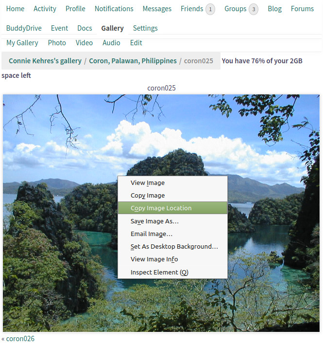
The URL or location of the image is copied into a browser copy buffer (a place in memory where it can remember the address). You can access this later by pasting the buffer or simply the standard CTL-V shortcut. In our example the URL that is copied looks like:
https://teachers-network.com/wp-content/uploads/mediapress/members/2/22531/coron025.jpg
The img tag we need to build looks like:
<img src=”https://teachers-network.com/wp-content/uploads/mediapress/members/2/22531/coron025.jpg” alt=”Coron, Philippines”>
This displays a full size version of the image into your document at the place you put your img tag. To resize the image to fit in properly with your page you may need to adjust the img tag settings. See the Teachers Network CSS Style Reference How-To Guide for ways to do this.
This approach works great if you are directly editing HTML in the text mode of the editor. If you are using the visual mode of the editor there are a few extra steps involved. No knowledge of HTML is necessary and this should be a lot easier for most people to use. To start with go into your document and place the cursor where you want to insert your image. Then select Insert -> Add Media from the editor menu bar. This brings up a new window where you can add media to a page. This can be one of your own files on your computer, or in our case, existing images we know the URL’s for. The page that comes up will look similar to:
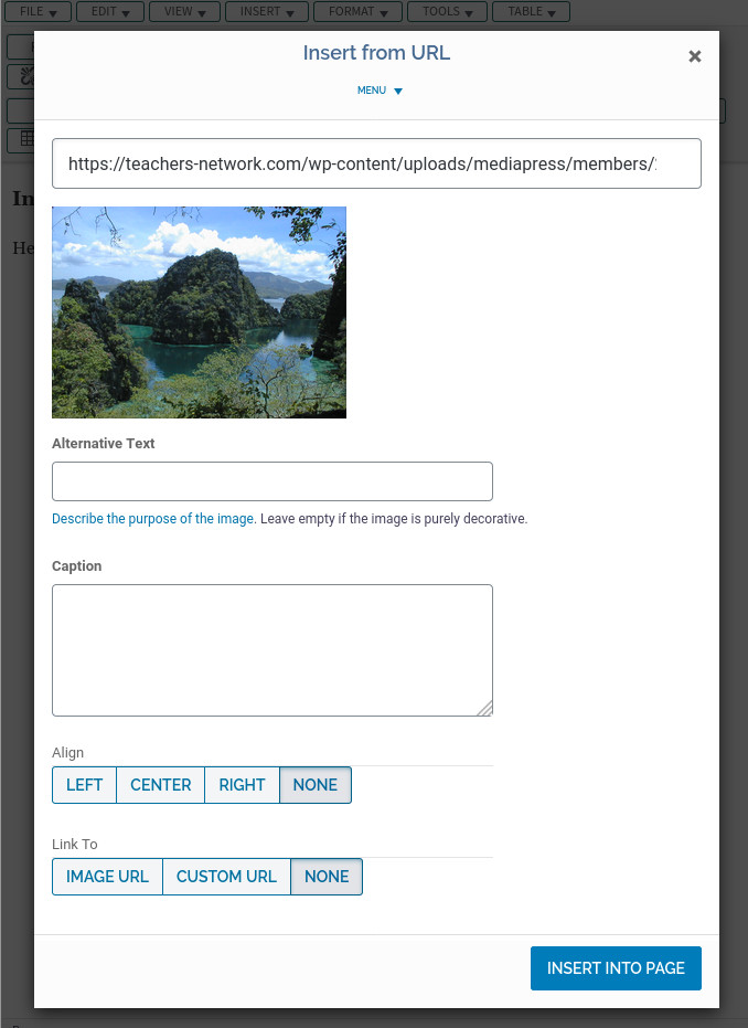
The right column of the display shows several actions to choose from including ADD MEDIA, CREATE GALLERY, FEATURED IMAGE and INSERT FROM URL. Click on the INSERT FROM URL option to bring up the above window. We went ahead and copied the URL from the browser buffer by clicking inside the text window and then pasting the buffer in. This can be done using the standard CTRL-V (Ctrl key and ‘v’ key depressed at the same time) shortcut. You can also paste in most desktop browsers by right clicking in the text box and selecting Paste. The screen shot above truncates the display as the URL length is wider than the window size selected here. You can either scroll through the URL field or display in a larger window to see the full content.
Important Note: when using images or other content from third parties make sure you have permission to use. Some images can be used from public sources but regardless if the content is not yours, ALWAYS provide the proper references to the content owner including obvious labeling of the image and a link back to the original content. The only exceptions to this are for content that you own the rights to, or images that are published with a clear open license to use.
The text that goes in the alt= option can be entered in the Alternative Text box. Optionally you can set the alignment of the image on the page and also enclose the image in an anchor tag with the Link To box. When done click on the INSERT INTO PAGE button to apply the changes to your page. You should see something similar to:

More information about Teachers Network Galleries can can be found on the Galleries How-To page.
Introduction to CSS
 Designing pages for a wide range of display sizes and types and the images that go with them can be tricky. Pulling in content from other sources further complicates the problem.
When designing new pages, the layout, or where things are placed on the page is very important. This is what we see when the page is first being loaded. How your page looks establishes what the visitor thinks of your content or brand. Unattractive pages usually get left behind quickly. A lot goes into good page design but one thing we can do is to establish a uniform look and feel to images and where they are placed. A page with many different image sizes and dimensions looks sloppy, cluttered and unprofessional.
Display Requirements
Modern page design requires that we take into consideration a wide range of display sizes. Small cellphones have widths of about 320 pixels or less while large desktop displays commonly have widths of about 2000 pixels or wider. Newer cellphones, tablets, and other devices have dimensions between these extremes. Designing for specific window dimensions is no longer reasonable. Instead we use what is referred to as responsive design techniques. These allow us to design pages once and have them displayed appropriately on whatever size device the visitor is using (within reason).
Does this mean that we need to spend a lot of time with every page we design to make sure it looks correct everywhere? Fortunately this is not necessary. To make this happen we separate the content from the instructions on how to render or display that content. This sounds complicated but it’s really not too bad. HTML provides a basic way to label content so that browsers can start to figure out what, how and where to put things on the screen. The missing piece that we need is CSS. CSS, or Cascading Style Sheets, is a language or set of rules for describing the look and formatting of content. With CSS we tell the browser, separate from the content, exactly how to render specific types of information. These instructions can further take into consideration display size and orientation (landscape / portrait). Separating rendering information (CSS) from content (HTML) makes it a lot easier to design and write pages without worrying about the device(s) they will eventually end up being displayed on.
Tag Labeling
 In the Creating Links in Content How-To guide we learned about additional attributes for the anchor tag. These were the href=, alt=, and target= attributes. It turns out we can label ANY tag in a standard way so that it can be associated with CSS rendering rules. By setting the style attribute of a tag, CSS rules can be applied by the browser to properly render the content within the tag. No display specific coding is needed in the HTML other than correct labeling of the content.
Let’s take a look back at our Coron, Philippines image tag that we used above. We will simply add a style= argument to the tag (and convert to a relative URL):
<img src=”/wp-content/uploads/mediapress/members/2/22531/coron025.jpg” style=”tn-image-300″ alt=”Coron, Philippines”>
This is exactly the same tag as we used before except we inserted style=”tn-image-300″ inside the tag. This attribute says to associate the style named tn-image-300 with this tag. The Teachers Network CSS file that gets automatically loaded with all Teachers Network pages includes the tn-image-300 rules that the browser uses to render the image. This particular style sets the image width to 300 pixels and for small devices also clears all other content on the same line, centering the image. The content writer does not have to worry about how to resize, or image placement when writing their content. They only have to label it as tn-image-300 and the back-end CSS definitions take care of the rest.
Note: A complete list of Teachers Network CSS styles is found in the Teachers Network CSS Style Reference How-To Guide.
The image at the top of this section uses this exact tag with the addition of the alignright attribute to right justify the image. When displayed in portrait mode on most standard cellphones it takes up the full width of the display and is centered. For larger displays it is displayed as a 300 pixel wide, right justified image. The actual image taken from the gallery page is 1024 pixels wide. By simply labeling the image tag we are able to position and resize without worrying about any of the details. This is the beauty of using packaged CSS definitions.
Setting CSS Styles Using the Visual Editor
To accomplish the above image inclusion using the visual mode of the site editor, insert exactly as we did before. If you want to right justify the image as we did above just click on the RIGHT button under the Align group before clicking on INSERT INTO PAGE. Now that you have your image inserted into your page, the style attribute needs to be set. To do this single click on the image. A small popup menu should appear above similar to:
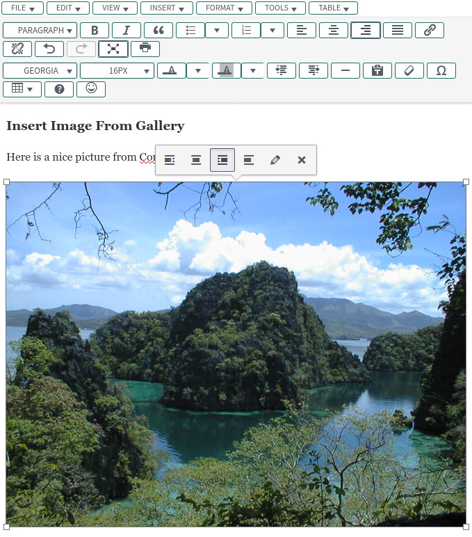
Click on the icon that looks like a pencil (Edit) to bring up the image edit screen:
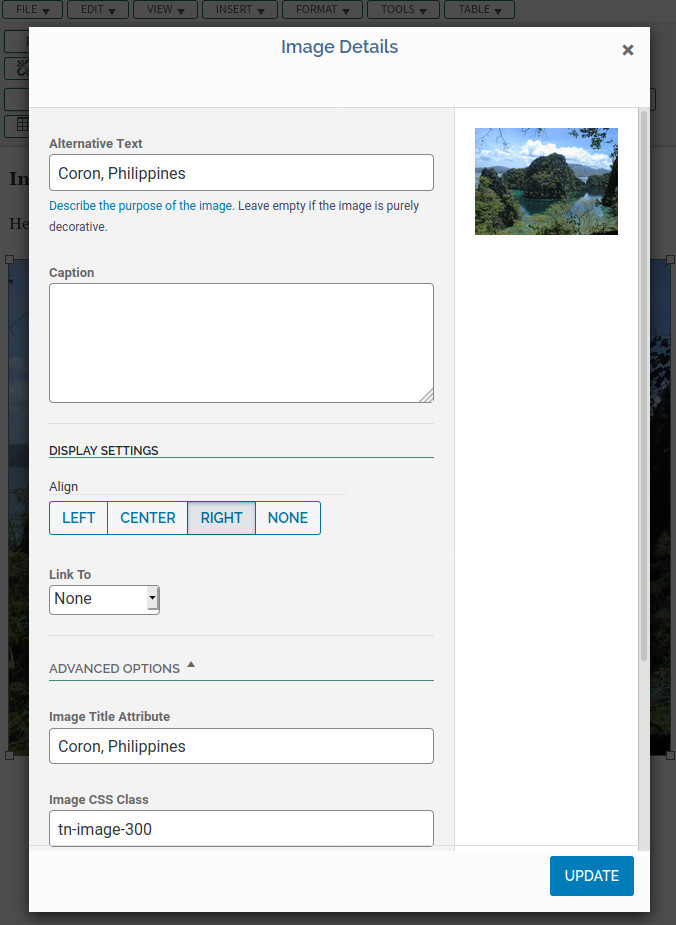
Under ADVANCED OPTIONS you can set the Image Title Attribute as well as the Image CSS Class. This is where we enter the tn-image-300 CSS style name. If we had more styles to define here we could just list them here separated by spaces. When you’re done click on UPDATE to return to the site editor window.
Note: the site editor does not always apply local CSS styles within the visual mode. This is a problem we’re looking into and hope to have fixed in a future release. The assigned style(s) will however be applied correctly when displayed in the actual page.
Other Useful How-To Guides
- How-To Guide: Using The Site Editor
- How-To Guide: Blogging
- How-To Guide: Galleries
- How-To Guide: Groups
- How-To Guide: Forums
- How-To Guide: Document System
- How-To Guide: File Storage System
- How-To Guide: Setting Up A Member Home Page
- How-To Guide: Profile and Content Guidelines
- How-To Guide: User Account Settings
